Showing posts with label Geography Picture of the Week. Show all posts

Friday, 7 October 2011

Geography Picture of the Week - Kerala churches rewarding big families

I realise that this week's Geography Picture of the Week post is not particularly centred one specific picture but I just read this story online and thought that it may be of some interest and, as an added bonus, it is related to human geography and links can be made to our current module.....

Hindu groups have said the two child policy should be imposed as
 there are limited resources
It seems like ages ago that we studied the AS population module but do you remember that really interesting case study of Kerala, in India, that we learnt about. Well I am guessing that it is probably quite a good case study to know a little bit about for this current module - here is the basics incase you have forgotton.......

KERALA :- Kerala is a really good case study to know about as it is an anomally to the general pattern between population and development indicators in LDC's/MDC's and it also demonstrates the spatial differences within countries themselves.
  • Kerala is India's longest lived, healthiest, most gender-equitable and most literate region with one of the best education systems. The state's basic human development indices are roughly equivalent to those in the developed world and the state is substantially more environmentally sustainable than many of the countries in Europe and North America. A survey conducted in 2005 also concluded that Kerala was the least corrupt state in India. Although Kerala is a poor state with a GDP of around $11000, it has very good demographic indicators........
    • Population = 31.8 million
    • Life expectancy = 73.3 years
    • IMR = 20/1000
    • Literacy rate = 96.6%
    • CBR = 14/1000
    • CDR = 6.4/1000
    • TFR = 1.7
  • WHY? 90% of the people own the land they live on, and each family can only have a maximum of 8 hectares. In 1957 a communist government was elected to power and fair price shops and ration cards were introduced to ensure that everyone could afford to eat. This government has a strong commitment to female education and a participatory democracy in which; every 10 years, 10% of the population are invited to meeting to express their views and help make decisions on how to take Kerala forward.

So, what is happening in Kerala at the moment that is so interesting. Well, several Christian parishes, Catholics and Muslim groups in this developed state have started to offer incentives to couples who have more children, with one church reportedly offering 10,000 rupees ($200) for a couple's fifth child. Now in a country with a huge population that is only projected to continue to grow, passing that of China's by 2030 whilst having massive problems with water security which are only likely to worsen as a result of global climate change and with sea level threatening to displace millions; to me this seems like a really strange idea - trust me after spending 10 minutes in an Indian city you will fully appreciate why the last thing this country needs is more people!

The move by local churches comes after a report submitted to Kerala's chief minister proposed imposing a strict two-child policy. So, why excatly are the churches feeling the need to encourage couples to have more children? Some feel it is because the church groups are concerned about the dwindling numbers of Christians in the region; with the lastest censensus showing numbers are in steady decline and risk slipping below 18%. This is probably not really an excuse to pay people to have more children in a country that greatly struggles to provide for its already huge population. If you think back to when we learnt about population policies, you will probably remember all the disadvantages and negatives of the Chinese 'one child policy and many of the same opinions are being aired in Kerala by religious groups, prominetly the view that it is solely a personal decision on how many children a couple should have and consequently the church feels that any finanical punishments placed on couples for having more than two children should not prevent them from doing so and that the ruling encroaches upon the right to religious freedom. These rewards have not be announced by the church statewide yet but many individual parishes are choosing to other incentives in some form, including free treatment and the parish run hospitals. 

Although to many families these incentives will look rather appealing the punishments recently recommended by the panel for the Commission of Rights and Welfare of Women and Children, which include 3 months in prision or a 10,000 rupee fine for any father expecting his third child, are probably harsh enough to put many off.

The Hindu United Front, who strongly support the introduction of this policy, believe that "the two-child norm should be strictly enforced in India as we have limited resources to share among us"and they are definetly right about the country having limited resources when considering its population size!

Let me know what you think! Should a population policy be enforced in India? Does its forever increasing population help or hinder its development?

Friday, 23 September 2011

Geography Picture of the Week - Highest resolution global map of ocean surface salinity

First up, the most observant of you will notice that I have changed my 'Geography Picture of the Day' to 'Geography Picture of the Week' as, in reflection, it was always high unlikely that I would post a picture everyday! Instead, hopefully, I will be more likely to post one weekly and although I am guessing that most will be linked to physical geography, I will try and find some relevant to our current human module........

So, what is my Geography Picture of the Week this week???


I apologise to any of you who are getting fed up with oceanography-related posts (my EPQ will be over very soon so hopefully I won't be so tempted to write about oceanography stuff all the time when I should really be writing about Development and Globalisation!) but I really couldn't resist posting this one!!!

The above image was released by NASA and represents the one of the first and high resolution global map of ocean surface salinity made, using data acquired by the Aquarius/SAC-D satellite, launched in June this year with the map itself only incorporating the first 2 and 1/2 weeks of data since Aquarius became operational on the 25th August. Scientists have been able to measure ocean salinity for decades by lowering instruments from ships or by deploying robotic floats, but the technology to gather data from orbit is a recent innovation.

The generation of this map has been long anticpated by oceanographers and meterologists so I am guessing there are a few very happy scientists around the world at the moment! If you have followed any of my highly unorganised posts on oceanography you might be able to appreciate why........

Well, our ability to map and thus determine salinity (basically the 'saltiness') will improve our understanding of ocean circulation, the risks of future alterations to it and also an understanding of a few key climatic processes (note that the oceans and atmospheres are incredibly closely coupled with, in simple terms, the oceans provided the memory for the climatic signals generated in the atmosphere).

So, what excatly does this map show? Well, the red and yellow colours represent areas of high salinity with blues and purples denoting those with low salinity and black showing areas with no data(note no data retrival on land). The maps clearly shows well-established, large scale features, significantly the major salinity differences between the Atlantic, Pacific and Indian oceans. With the Pacific ocean by far the 'freshest', supporting the absence of deep-water formation sites, and the Atlantic by far the most saline. The salinity of ocean water is intrinsic to ocean circulation, although most precisely thermohalince circulation, which is soley driven by density differences (salty water is denser than less saline waters and so is forced to sink, thereby helping to drive the circulation). Also apparent is the corespondance between areas of lower salinity and rain belts and the areas of high evaporation found in the subtropics (regions of evaporative enrichment). Smaller-scale features are also possible to identify like the freshwater outflow from the Amazon River which acts to dilute immediate Atlantic surface waters.
The goal of the Aquarius mission is to retrieve salinity with a resolution of 0.2 parts per thousand (a concentration change equivalent to about one millilitre of salt in six litres of water). Aquarius carries three high-precision radio receivers that will record the natural microwave emissions coming up off the water's surface; emssions varying with the electrical conductivity of the water - a property directly related to how much dissolved salt it is carrying.
Smos global salinity map
The Nasa-Conae spacecraft is not the first ocean salinity mission in orbit as Europe already have a satellite in operation (Smos) which was launched in 2009, producing the first ever global salinity maps generated from space. The intention is to inter-calibrate and combine the Aquarius and Smos measurements as, together,these spacecraft are now acquiring volumes of salinity data that dwarf all the information ever gathered in this field of study.

Monday, 22 August 2011

Geography Picture of the Day - Formation of the Gulf Stream


I have spent some time this afternoon trying to create a way of representing the formation and journey of the Gulf Stream with minimal text. I am really bad at writing succintly so this has been a bit of a challenge and there is still way too much text on it, but I thought I would share it with you all anyway (any feedback on it would be great!) as I think, when it comes to the climate module, we do have to know a little bit about ocean circulation and this particular current, along with the North Atlantic Deep Water (NADW), play an influential role in moderating our climate.

Saturday, 20 August 2011

Geography Picture of the Day - Could seawater solve the freshwater crisis?

By 2025, it has been predicted that 1.8 billion people will live in areas of extreme water scarity and so, desalination (the removal of salt from water) is increasingly being proposed as a solution to this huge problem. However, before desalination can make the impact required to solve the looming water crisis, much worl needs to be done to overcome the obstacles that make it an expensive and inefficient process......
Desalination plants such as the U.K.'s Thames Gateway facility use
reverse osmosis technology.

Scientists predict that by 2016, the amount of fresh water produced by desalination plants will exceed 10 billion gallons (38 million cubic meters) a year, or double the rate in 2008. Modern desalination plants use a technology called reverse osmosis,  which involves pressing salty water through really thin, semipermeable plastic membranes. Unable to pass through, large molecules or ions, such as salt, are filtered out, so fresh water flows out the other side. This method wastes much less energy than earlier desalination techniques, such as heating seawater and harvesting fresh water from the steam. However a typical reverse osmosis plant can still spend up to 40 percent of its operating costs on generating electricity to run the system—a big reason engineers are searching for ways to cut costs and make plants more efficient, starting at the membrane level.

Sounds like this technology, especially if the amount of electricity required can be reduced and the efficiency increased, could be used a lot in the future to try and secure water supplies. However, I am sure that it has other disadvantages, like the environmental impacts on oceans and ecosystems. Also what would you do with the salt as I am guessing if it is on a large scale then quite a bit of salt will be produced? Linking it to my EPQ, I am unaware of how much salt would be produced but by dumping the waste salt back in the oceans, whilst removing large volumes of water, the salinity of the oceans will be affected - something intrinsic to the stability of the thermohaline circulation..........

Monday, 27 June 2011

Geography Picture of the Day - Ocean currents carving out cavities in glaciers

Whilst doing some research for my EPQ, I came across this picture.......
Pine Island glacier ice shelf in Antarctica
This image shows the impact of stronger ocean currents on glaciers. Increasing winds over the South Pole, over the last few decades, is one possible reason for the increasing strength of the ocean currents. This increase in strength has lead to the chiselling of the ice beneath the ice shelf, provoking the formation of the cavity above. This cavity has allowed for warm water to flow into the glacier; increasing the rate of melt as the warm water upwellings, from the deep sea, melt the glacier from below up. Despite only a 0.2 degree Celcius rise in surface sea temperatures in this region, the melt from beneath the shelf has increased by 50% (both over the last 15 years), and scientists believe that this could be one possible reason. Therefore they are hoping that if they are able to calculate the changes in ocean currents, especially their strength, then they will be in a better position to predict the rate at which Antarctica's glaciers are melting and so what contribution they will provide to rising sea levels.

Friday, 24 June 2011

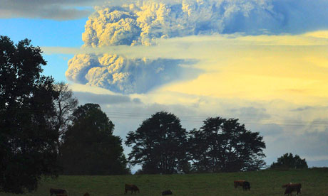
Geography Picture of the Day - Chilean volcanic ash cloud

The ash cloud from the Chilean volcano has looped around the world and is disrupting Australian airlines for a second time. The Puyehue volcano, in southern Chile, first started erupting on the 5th June and by the 11th June the resulting ash cloud compeleted its first ciruit around the world, provoking flight cancelations  in South America and and Australia. It is estimated that some 120,000 passengers had their flights cancelled in Australia due to the ash cloud. However, some flights were able to go ahead as some planes were able to fly just below the ash cloud. Since then, the ash cloud has become wrapped around a low-pressure system, whilst it loops around the world once again, thereby pushing it about 2100 metres lower than it previously was. Therefore the base of the ash cloud lies at around 6000 metres, making it too low to safely fly under.

Although officals say that the volcanic activity has decreased slightly, it is predicted that it will continue to spew ash for some time yet.
After the Icelandic volcano practically paralysed Europe last year and the impact that the Chilean volcano is currently happening, is it possibly time to re-evaluate the transportation methods used to travel around the globe?

Wednesday, 8 June 2011

Geography Picture of the Day - Why has the USA experienced so many tornadoes this year?


An image shows the damage created by a tornado last week in the USA.
The community featured, to the right, is the community of Sturbridge and is
one of many that settlements that was damaged by the tornado.

The brown scar that runs down the middle of this image depicts the path taken, and the devastation left in its path, by a tornado that ripped through south-west and south-central Massachusetts last week. The tornado travelled over 63 kilometres and was 800 metres across at its widest point. Rated 3 out of a potential 5 on the enhanced Fujita, or EF, scale, it left four people dead, overturned cars and reduced buildings to rubble.  The EF scale, similar to the Fujita scale, has the same basic structure of 6 catergories (zero to five) and is used to represent the damage inflicited by tornadoes. The main difference between the Fujita scale and the revised EF is that the EF was designed to reflect better examinations of tornado damage surveys so that winds speeds could be better aligned with the damage caused.

This tornado is one of more than 875 tornadoes to have hit the US since the beginning of the year which, in total, have claimed the lives of more than 363 people, thereby,  making 2011 one of the deadliest years on record for US tornadoes (link to an interactive map that compares the number of deaths, caused by tornadoes, over the last decade)

So, just why have the USA experienced so many tornadoes? Well, for a tornado to form, cold air needs to sit upon warm, moist air whilst the winds need to go in different directions, at different heights.

(Slightly more detailed explanation of tornadoes formation)

 Over the last couple months, the jet stream, which has been stronger than usual, has dipped south over south-west America, therefore bringing them a string of storms. This change in path has been sustained which is why the south-west of the USA has frequently witnessed devastating tornadoes.

 Does it link to global climate change? It is impossible to unambiguously link this to climate change, due to a lack of older records, but many say that the frequency of such tornadoes has increased over the past decade. So, could this become a common occurence.............. It is hard to say as the effect of global climate change on tornadoes is unknown as, although rising global average temperatures will mean that their is more warm air around, it could also reduce the temperatre gradient between the poles and equator - the crucial factor that generates the jet streams in the first place. One thing is for sure though, after the destruction caused, so far, this year, the people of America will be hoping that this doesn't become an annual event.


Sunday, 5 June 2011

Geography Picture of the Day - Puyehue volcano chain

My Geography Picture of the Day, today, is an easy choice if I am honest..........
Click on the link for the news clip from the BBC, accompanied by their report
http://www.bbc.co.uk/news/world-latin-america-13657187
As I am sure most of you are aware, the Chilean volcano chain Puyehue has started erupting for the first time since 1960. The volcano chain is currently spewing smoke and ash high up into the sky. Around 3,500 people have been evacuated from the nearby area, which is 500 miles south of the capital, Santiago, with the area on red alert. The area has been on red alert since Chile experienced a flurry of earthquakes, with an average of 230 tremors an hour. The ash is reported to have reached neighbouring Argentina where people ahve been advised to reduce the time spent outside to a minimum and the local airport has since been closed.

1960 eruption

Current eruption
The last major eruption started on the 24th May 1960, 38 hours after the largest earthquake experienced on record, the Valdivia earthquake,

Thursday, 2 June 2011

Geography Picture Of The Day (sort of) - Could ancient bacteria power the world?

The words oil and renewable are not something I think I have ever used in conjunction but this could all change in the near future.....

Oil is used relentlessly across the globe, despite the apparent detrimental environmental impacts, and for many years now the thought of renewable oil has been too idealistic for many to even dare to consider. However, this once idealistic idea, is now getting serious consideration from many scientists.

The above picture just looks like a few tanks filled with a rather vibrant green liquid but this is in fact the ancient bacteria that has got many scientists very excited. Cyanobacteria have already played a huge role in the history of the Earth as, around 2.4 billion years ago, they were the first microorganisms to start to oxygenate the Earth's atmosphere. Now, scientists hope that, after a bit of persuasion from a tad of genetic engineering, they could possiby help us out in the future by utilising our waste carbon dioxide (something that we seem to have an abudance of after the announcement made by the IEA which suggested that last years energy - related carbon emissions reached an all time high) and a little sunshine to secrete alkanes - the crucial ingredient of diesel. This would offer a very 'green' fuel, that could be considered to be solar-powered oil, as, primarily, the microbes could be fed with the carbon dioxide emmited form industry and, this form of biofuel, would not require vast expanses of fertile farm land to be used to grow crops like sugar cane as, due to the need for sunshine, the most commercially viable location for these photobioreactors would be in deserts.

This third generation of biofuels is, with good reason, attracting millions of pounds of investment - especially in America. This latest technology is far from being capable of producing a commericailly viable fuel but, this third generation biofuel is only in its infancy and so there is still hope for the production of a renewable oil and so no longer is the idea of making oil from sunshine one only found in the dreams of many energy producers.

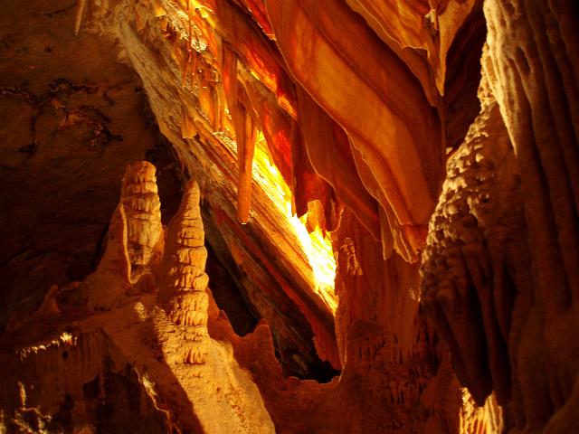
Geography Picture of the Day (for yesterday) - Stalagmites, Stalactites and Cave Curtains

Among the most fascinating and beautiful features found in caves are the hanging spikes called stalactites and the rising pillars called stalagmites. The word 'stalactit' comes from the ancient Greek stalaktites which translates to 'that which drips'.

Both form when dripping water deposits calcium carbonate and other minerals weathered form the rock above.  Stalactites and stalagmites are most common limestone caves, although they also occur in lava tubes and even abandoned concrete builings.

Stalactites form as, with each drip, a tiny ring of calcium carbonate is left on the cave roof. As more and more rings are added, the stalactite grows. Young stalactits have a straw-like structure, but if these fragile tubes become plugged by debris, the water begins to run down the outside as well as the inside, leading  to the familar inverted cone shape. Stalactites can become extremely large - one hanging 63m from a roof in the Cueva de Nerja on Spain's Costa del Sol is claimed to be the world's longest stalactit so far measured.


Stalagmites - such as the so-called Totem Pole in the carlsbad Caverns of New Mexico, USA - grow upwards from the cave floor. Sometimes stalactites and stalagmites meet to form columns.


Another striking feature is a 'curtain' which is a wavy drape-like formation that hangs from the roof of a cave. This occurs if the angle of the roof inclines at an angle of around 45 degrees. Water runs down it, depositing calcium carbonate along a narrow line. The deposits build up and the resulting curtain grows in much the same way that a stalactite does. Such cave curtains can be found in the Wombeyan Caves in New South Wales, Australia.

Tuesday, 31 May 2011

Geography Picture Of The Day - Terraces of Pammukale

I thought I would try some new, different things on this blog to try and make it a bit more visual as I realise that, normally, I just write a lot and so it doesn't look that exciting. Firstly I thought I would, as often as possible, write about a geography related picture that has interested me or made me stop and think.........


These are the snow-white terraces of Pamukkale in south west Turkey and I have never seen anything like these before and, because they look quite unusual, they caught my eye in a book I was looking at the other day. Pamukkale itself means 'Cotton Castle' which isn't hard to see why when you look at some of the images of these terraces.

 So, how do they form? Well, Pamukkale is located along a tectonic fault line and the area is full of hot springs. These hot springs are crucial in the formation of the terraces as they are made of travertine (a form of limestone), which is a sedimentary rock that is deposited by the hot water. The water temperature in this area is, on average, around 36 degrees Celcius and is enriched with a number of different minerals. The presence of different minerals effects the colour of the travertine which can also be red, tan or cream in colour but when free of impurities it is white. The mineral rich water leaves the springs, and flows down over the terraces. As it does so, the minerals in the water react with the oxygen in the air and carbon dioxide is produced and released and this degassing of the carbon dioxide leads to the deposition of calcium carbonate. Evaporation then leaves behind the calcium carbonate and other minerals which harden into a chalk-like sinter. This calcium carbonate accumulates everywhere, covering every surface, stone and rocky slope in reach. Therefore, layer by layer, the landscape around the hot springs has whitened and hardened and the terraces, themselves, are continually resculpted by the warm subterranean springs that seep through the surface.