Showing posts with label Geographical Skills. Show all posts

Saturday, 16 June 2012

Presenting the data in 4B Nepal AIB

Hello everyone, I have had a request to go over the data representation specific to this AIB and fortunately there is not a lot of data so this post will be relatively short -  I hope the revision is going well!!!

Figure P2 - Climate of Kathmandu
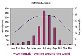
Don't think this is the exact same data as in AIB!
Well there is only really one option for this one..... a climate graph!!! So the bars represent precipitation (in mm) and the line temperature ( in degrees C), therefore there are often 3 axis which all need to be numbers, with months on the x-axis. Not really sure what else to say about the climate graph other than it is good as you can represent both precipitation and temperature on the same graph which in the case of Kathmandu shows clear correlation between the two i.e the warmest month (July) is also the wettest, it is very easy to highlight peaks and easy to plot/read. Interestingly, if you compare this data set with the P3 (the number of tourists) the lowest number of tourist arrivals seems to coincide with the most 'extreme' weather, which could possibly be explained by looking at P4 at due to why people visit Nepal.
Figure P3 - Total tourist arrivals in Nepal, excluding Indians, per month (2007)

For this data set, a line graph is probably most suitable as it suugests conitinuous variation over time, something that is crucial when displaying tourist arrivals per month, but most importantly only continuous variation in one variable. Line graphs are visulally effective and easy to read sa peaks in the data are clearly visual. This therefore is more appropriate than stacked bar charts, which represnt a range if information which is not related, or a bar chart which suggests discontinuous variation. So to plot the line graph months of the year should be placed along the x-axis and number of tourist arrivals each month along the y-axis. On the y-ais I would use a false origin and start the scale at 15,000 and then go up in 5,000. After labelling bith axis, the data points in P3 should be plotted accordingly.

Figure P4 - Tourist arrivals in Nepal, by type (2007)

Now, I think there are two options for this one! First up is a pie chart which can be used to show the share total value of something. They are visually effective but difficult to read and accurately assess the percentages, whilst also not offering raw values - although to compare something precentages are best to use. To construct a pie chart you need to first draw a circle! Then the data needs to be converted into percentages (divide the number by the total and times by 100), then multiply by 3.6 to convert it to degrees. You are meant to start at a vertical position and measure round clockwise from this point, and include a key. Another option is a stacked bar chart which shows a range of information on the same topic which is not necessarily related. This is an easier way to clearly compare date from different locations, and is less time consuming as can either be plotted with percentages or raw values. There is probably not a lot of difference between the two, but which ever one you pick you need to be able to justify why you picked that one. One issue though with the data in P$ is that there is significant overlap between the categories, with the possibility of a tourist being considered in more than one, therreofre it is debatable how reliable/significant trends shown are.
I realise that this sounds really patronising but I think the main lesson I have learnt from the Poole exam is that you have to explain things really well and write as if the examiner doesn't really know an awful lot when it comes to questions like 'how would you represent data in fig....?'. Therefore not only to do you need to know how to plot each one, but also justification for use. The above are the ones that Nick feels are the most likely to come up as are relevant to the data in the AIB, but briefly looking over other methods of representation may be a good idea. The main other skill that Nick has mentioned a lot is commenting on photos, perhaps talking about to what extent they show the Himalayas to be a fragile environment....remembering that labelling pictures is considered a geographical skill! A quick note on this, I would say that the pictures in the AIB and those referred to (probably a very good idea to look at those before Tuesday!!!) are arguably biased as not only were they taken by a tourist so show touristy places, and therefore regions damaged by tourism but they were also taken by a geographer who would no what to look for in regards to environmental fragility and damage. But they do still offer a good insight in Nepal, and considering we couldn't exactly go there on a fieldtrip, it is all we really have to rely on!
Anyway, I hope this was helpful, let me know what you think about this, and if you have any more requests....

Tuesday, 17 January 2012

Sampling Methods

Sampling methods are something most of us seem to have forgotten about from last year (it probably wouldn't do you any harm to dig out you green skills booklet from last year!) but it is important that we mention them in our methodology. So what excatly are they and why do we need/use them???

SAMPLING = A means of collecting data that is representative of a particular issue or subject area without actually having to record every bit of data
--->All data collection operates within a number of constraints, although particularly the area that has been selected fro studt and the time that is available for data collection. Whilst in some circumstances sampling is necessary, using sampling means it is possible to save time and money without jeopardising the quality of the data that is collected.

Avoiding Bias.....
 - When deciding how to take a sample and how many samples to take the main consideration is obtaining representative results = avoiding bias
- Bias can be caused by many things such as not taking enough samples or collecting the data at the wrong time or by chossing the wrong method in order to decide who/what you will sample

Sampling Methods.....
Point Sampling :- Involves choosing individual points and sampling at this points, such as specific houses down a street
Line Sampling :- Involves taking measurements along a line, for example to sample vegetation across sand dunes you may lay a tape across the dune
Random Sampling :- Sampling using random numbers, where each item in the parent population must have an equal chance of being selected for the sample
Advantages:
        - Removes human bias involved in the selection process
Disadvantages:
        - If sample size is quite small you might obtain an unrepresentative result
        - Access may be an issue
Stratified Sampling :- Deliberately choosing which bits to sample - usually to ensure coverage of all areas you want to study, based on prior knowledge.
Advantages:
        - Avoids bias that can arise from random and systematic sampling as ensures that each group is fairly represented
        - Ensures all areas are covered
Disadvantages:
        - Difficult to know excatly which subsets of data you want to include
        - Access may be a problem
        - Requires good prior knowledge of an area
Systematic Sampling :- Data is collected at a set interval, such as every fifth house or every 5 metres
Advantages:
        - Quicker, easiers and more convenient to carry out than random sampling and can be more accurate because avoids the remote possibility that the random sample selects too many examples from one part of the distribution
        - Ensures good coverage of an area
        - Accurately reflects continous changes in variables
Disadvantages:
        - Can inadvertently pick up bias, e.g sampling every 50 metres along a beach may also coincide with location of groynes
        - May exclude key sites
Pragmatic Sampling :- Based on practical reasons, for example you cannot trespass on peoples property and would not sample sediment in a deep fast flowing river

Combining Sampling Methods.......
It is possible to combine some of the sampling methods during a fieldwork investigation and this is often the best thing to do so, as an example if you were to plan a questionnaire for Poole, you could use startified sampling to ensure that various age/gender groups are included within but use systematic sampling to decide who precisely to ask, such as every 5th person. Whilst you would probably use a combination of stratified and pragmatic to decide on the location for your questionnaire.

Sunday, 15 January 2012

Chi Squared

Last Stats test - although probably my least favourite!!!
 Chi Squared = used to show whether there is a siginficant difference between the expected frequencies and observed frequencies in one or more categories
---> Could be used in Poole, for number of people walking in the Hamworthy regeneration site, before and after the brdige is built
Worked Example (the one we did in class)
As with the others, the first two things to do are to set a null and positive hypothesis (there will/won't be a difference between expected and observed frequencies) and then set the data in a table. O represents the observed data, so this is the relevant figures from the table in the AIB, or if you were to conduct fieldwork i.e a traffic survey, the results of your survey. Then you have to add up the totals of the columns and rows....
For row SOA = 76 + 16 + 8
                      = 100
For column 'Owner Occupied' = 76 + 94
                                                 = 170
.....The most important total to get correct is the GRAND TOTAL. This is the sum of all the row totals which, if you have done it correctly, will also equal the sum of all the column totals and vice versa
Sum of Row totals = 100 + 100
                               = 200
Sum of Column totals = 170 + 18 + 12
                                    = 200
Next you have to calculate the expected values, E.
E = row total x column total
For the first 'box':
E = 100 x 170 = 85
           200
Note, that it is just coincidence (or clever planning by the teachers!) that the E values are the same down the columns - this is not always the case.
Now you have both O and E and so can use the equation. For each 'box' you need to minus E from O, square the answer and then divide by E (O – E)2
                                                                    E
For the first box:
O = 76 and E = 85
So, O - E = 76 - 85 = -9
-9 x -9 = 81
81 = 81
 E     85
= 0.95 (to 2.d.p)
The final step is to add all those numbers up that you have just calculated (the red numbers) as, refering back to the formula, this gives you the value of Chi Squared
0.95 + 5.44 + 0.67 + 0.95 + 5.44 + 0.67 = 14.12
This is your value of Chi Squared but before you can 'use' it you have to compare the result with the critical values according to degrees of freedom. The degree of freedom for Chi Squared can be calculated by:
Degree of Freedom = (number of columns- 1) x (number of rows -1)
With this example, we can say with 99% statistical significance that there is a difference between the observed and expected values.

Well, that is the last of the statistical tests we need to know - if anyone would like any more examples from the AIB then just ask; I realise that the above example is one we did in class, so at some stage I may add another example from the AIB. Next up I am going to focus on fieldwork, like sampling techniques etc and also summarising some general information about Poole and the regeneration project - I hope the revision is going well!

Thursday, 12 January 2012

Mann Whitney U

Mann Whitney U = A test for difference between two sets of data
---> If we were studying Poole for a long period of time you could conduct a traffic survey at two different times, then use the two sets of results to do a Mann Whitney U test to see if there is a significant difference in the data. This statistical test could then be followed by calculating percentage difference to see how significant the difference is - could be utilised to prove/disprove whether traffic, and therefore congestion, is seasonal in Poole or even before and after the Twin Sails bridge has been built to see if traffic flows across the existing Lifting Bridge have changed.
---> Statistical result of Mann Whitney U is often used to aid the geographical explanation of the distributions mapped
---> Note that whilst result tells us that there is a significant difference, it cannot be used to explain why that difference exists

There are two ways you can do the Mann Whitney U calculation - a non-mathematical way and a slightly more mathematical way. The first is the way we did it in class......
Again, the first stage is to set a null and positive hypothesis:
Positive Hypothesis:- There will be a difference between the two sets of data
Null Hypothesis:- There will not be a difference between the two sets of data
A table is, yet again, the best way to set this statistical test out:
For every piece of data in set X give it a score if it is bigger than a piece of data in B or 0.5 if it is the same:
 - 21 gets a score of 1 as only 23 is bigger than it
 - 12 gets a score of 7.5 as 23, 18, 17, 17, 13, 20 and 14 are bigger than it, giving it 7 and it is equal to 12, adding an extra 0.5. Thereby bringing its total to 7.5
Then you simply do the same, but in reverse , for data set Y:
Add up the totals and take the smaller of the two totals as your U value:

Mann Whitney U is unusual as it is the only stats test where your result has to be smaller than the critical value to be significant. You can also have two data sets with differing amounts of data within.
Critical Value for 10 values in each data set is 23 so this difference is not statistically significant so we have to accept the null hypothesis.
The second, more mathematical way honestly looks a lot worse than it actually is, although if you are comfortable with using the above method, it is probably best to stick to that one (I probably will!), so this is just for those of you who are interested - I am going to use the first example we did in class......

First, rank all the values for both samples from the smallest (=1) to the largest, ranking samples the same way you do in Spearman's Rank if more than one is the same:

Total the ranks in each column:

Calculate the U values for both samples using the following formula [Note that na in formula should be larger sample size if difference is present]:
Ua = (10x10) + (10x11) - 70
                               2
= 85

Ub = (10x10) + (10x11) - 137
                                2 
= 18
Then you compare the lowest result to the critical values; this is below 23 and so the positive hypothesis can be accepted.

Well, I am nearly there with all the stats test - the last, Chi Squared, will probably appear sometime tomorrow!!!

Wednesday, 11 January 2012

Spearman's Rank

SPEARMAN'S RANK:- A test for the relationship between two variables
---> Not only does this test highlight a relationship but it also indicates the strength and statistical significance of the relationship, if any
---> You should always get a value between 1 and -1, if not then you have gone wrong somewhere! The closer to 1 the stronger the positive relationship, the closer to -1 the stronger the negative relationship.
---> Remember you have to compare you result to the critical values (I believe we get given these in the exam when appropriate) to see whether or not the relationship is statistically significant enough to accept and use to formulate conclusions regarding variables investigated.
Worked Example using Column C and Column F in AIB
The first thing you need to do is to set a positive and null hypothesis; the easiest way to do this is to say, 'There will be a relationship between x and y' and 'There will not be a relationship between x and y'. Although it seems a bit strange that you have to set a null hypothesis, it is actually more statistically reliable to disprove a null hypothesis than to prove the alternative hypothesis.
Positive Hypothesis: There will be a relationship between number of owner occupied dwellings as a % of total dwellings and of number of people in higher managerial and professional occupations as a % of total economically active.
Null Hypothesis: There will not be a relationship between number of owner occupied dwellings as a % of total dwellings and of number of people in higher managerial and professional occupations as a % of total economically active.
Again, the easiest way to do this calculation is within a table. What you need to do is to rank each variable independently, giving 1 to the highest and so on. When you have two values that are the same you add together the places they would rank, then divide it by how many would rank there (e.g if three values would rank 13, you add together 13, 14 and 15 and find the middle value which is 14 and asign each one 14), then skip the same number of ranks to ensure that the lowest ranking number is given the same number as n (number of values) - sorry this is really hard to explain in words but hopefully will become a bit clearer in a minute!
 Hopefully, the ranking part is quite logical. Within the first variable, when there was two 73, for example, that would both rank 14, you need to add 14 and 15 together, then divide by 2.
14 + 15 = 29
29/2 = 14.5 so, rank both 14.5 then skip rank 15 and move onto 16 for the next ranking number
After you have independently ranked both data sets, you need to work out the difference between the
ranks.....
Basically all you do, using first one as an example: 2 - 3 = -1
Then you need to square the difference, hence why it does not matter if the difference is negative.....
After squaring the difference, you need to add up all the values in that column, to give you the sigma d squared bit from the orginal equation...
S = 423
Now you have all the values you need so can just plug the numbers into the equation
Rs = 1 – (6 x Σd2)/n3 – n
Rs = 1 – (6 x 423)/183 – 18
Rs = 1 – 2538/5814
Rs = 1 – 0.436532507
Rs = 0.56
That is the calculation, itself, completed but now you have to see whether or not you can accept the relationship shown using critical values.
When n = 18
Critical Values:
95% = 0.4014
99% = 0.5501
---> Data reliability is related to the size of the sample. The more data you collect, the more reliable your result.
I think normally you are given these in the exam, but I suppose if the examiner was not feeling that nice, they could ask you to work out the 'Degree of Freedom', then use a graph to work out the values yourself!
Degree of Freedom = n - 2
So, in this example 18 - 2 = 16, so you draw a line up from 16 on the x-axis
---> After doing this, I can say that I can accept the positive hypothesis as it has a 99% significance, meaning that there is a relationship between the two variables. Looking at the Spearman's Rank value, I can then say that there is a relatively strong positive correlation within the data, so as the number of people in higher managerial and professional jobs increases so does home ownership in Poole. Without even knowing the first thing about Poole, this kind of makes sense, in a general context, but it is important to remember that just because the two variables correlate, it does not really prove anything - only further research can actually prove that one thing affects the other.
So, that is the last of the stats test that AS students need to know for their skills exam - I hope these posts have been helpful to you as well, there is one on fieldwork sampling on its way which might also be useful, and I hope the revision for your first A-level Geography exam is going well - unfortunately, for us A2 students, the stats test don't stop there; Mann Whitney U and Chi Squared are on there way!

Standard Deviation

STANDARD DEVIATION :- describes the average amount by which the values in a data set vary from the mean for that set.
---> It indicates the amount of clustering around the mean; showing how much the values are clustered allows the analysis of data to be taken much further than simply measuring central tendency.
In a normal tendency:-
- 68% of the values lie within +/- 1 Standard Deviation (SD) of the mean
- 95% of the values lie within +/- 2 SD of the mean
- 99% of the values lie within +/- 3 SD of the mean
---> A low SD indicates a more clustered distribution. A higher SD indicates a more spread-out/dispersed distribution.

Worked Example using Column B in AIB (Population density- persons per hectare)


4.42, 18.52, 16.73, 22.02, 38.44, 24.39, 36.64, 37.99, 23.04, 53.24, 33.66, 37.07, 34.97, 20.61, 27.76, 25.61, 26.04, 14.87
n=18
First thing to do is work out the mean, in the same way mentioned above: 495.9/18 = 27.55
                                                                                                                      
Then, you need to subtract the mean, individually, from each of the values in the data set and then square the result. This can take a while but I find it easiest and quickest to do it in a little table....
x
4.42
18.52
16.73
22.02
38.44
24.29
36.64
37.99
23.04
(x-x-)2
535.00
81.54
117.07
30.57
118.59
10.63
82.63
109.00
20.34

x
53.24
33.66
37.07
34.97
20.61
27.76.
25.61
26.04
14.87
(x-x-)2
659.98
37.33
90.63
55.06
48.16
0.004
3.76
2.28
160.78

Next, you need to add up all the values on the bottom row of the table - the (x- xbar) squared results - and this gives you sigma (S)
S = 2163.4


Then divide this value by (n-1), remembering than n = number of samples/values
2163.4/18-1 = 127.26
Then square root the result to give you your SD value,
Square root of 127.26 = 11.28
---> This result indicates that 68% of the population densities for the different regions of Poole lie within +/- 11.28 of the mean (27.55), illustrating large disparity across Poole in terms of population density.
---> Ideally when doing Standard Deviation you should complete one for two sets of data and compare the results (like you do for the Rivers fieldwork where you complete standard deviation for sediment size in pool's and riffles then compare the results, before using knowledge of Hjulstrom and velocity changes you recorded to explain why results deviate accordingly). So, as an example for Poole, if you calculate the standard deviation for 'owner occupied dwelling as % of total dwellings' (Column C) and 'rented from council or Housing Association as % of total dwellings' (Column D) you would see that Column C displays greater deviation than Column D, suggesting that across Poole, houses rented from the council are move evenly distributed than those privately owned and occupied, then using the background knowledge of Poole you have, you could try to explain why this trend occurs. 

Tuesday, 10 January 2012

Mean, Mode, Median and Interquartile Range

I realise that stats test are not everyone ones favourite thing to do and that most people find them very confusing, with even the thought of a table of numbers quite scary......however, with practice they are not too bad and you could never be expected to do a entire stats test in an exam due to time constraints; so as long as you are prepared for them, they can be quite easy marks to get (hopefully!).

I am going to start with the basics and cover the measures of central tendency as well as Interquartile range which, as a measure of dispersion, would perhaps be better placed with Standard Deviation. Any AS students reading this, apologises for the frequent references to Poole but I hope it still helps! The other 4 stats tests are quite lengthy so I will do a separate post for each one - they will hopefully appear very soon!

MEAN:- Add the numbers up and divide by the numbe of numbers
---> Often favoured over mode and median as takes into account extreme values, which the others disregard.
e.g 2,4,6,8,10,12,14
Mean = 56
              7
          = 8
MODE:- Most common number - if no number is more common then there is 'no mode'
e.g 2,4,6,8,10,12,14
Mode= no mode
e.g 2,2,4,6,6,6,8,10,10,12,14
Mode = 6
---> In Poole fieldwork it could be used to calculate which is the most common bird found in Holes Bay, for example
MEDIAN:- the (n+1) = value
                             2
e.g 2,4,6,8,10,12,14
Median = 4th value = 8
---> Could be used after traffic counts to estimate daily/weekly traffic flows across a particular area

---> If a set of values has a symmetrical distribution (normal distribution), the mean, mode and median will be at the same place. However, if the distribution is skewed, the mode will still be at the point of highest frequency but the median and mean will each lie elsewhere.

INTERQUARTILE RANGE (IQR) :- Distance between the 75th percentile (UQ) and the 25th percentile (LQ)
---> IQR is a measure of dispersion, with the bigger the IQR, the wider the distribution in the data.
---> Often used to draw 'box and whisker plots'/dispersion diagrams as they illustrate spread of a number of values around the mean value, enabling a comparison of spread and/or bunching of data.
---> IQR and Standard Deviation both measure dispersion (spread), but IQR is more resistant to outliers whilst Standard Deviation is sensitive to outliers and extreme observations.
Lower Quartile (LQ) = (n+1) = value
                                          4
Upper Quartile (UQ) = 3(n+1) = value
                                           4
IQR = UQ - LQ
e.g 2,4,6,8,10,12,14
LQ = (7+1) = 2nd value = 4
              4
UQ = 3(7+1) = 6th value = 12
               4
IQR = 12 - 4 = 8

Hopefully most people are okay with this, just ask though if you would like a worked example from the AIB.....
     
Standard Deviation and Spearman's Rank are on the way (I will probably do Chi Squared and Mann Whitney U at some point later this week - AS students, you are lucky enough not to have to know these two yet!).

As always, let me know if I have made any mistakes or if there is anything else you would like me to cover!!!

Wednesday, 4 January 2012

Graphical Methods of Presenting Data

This is perhaps more relevant to AS students with their up and coming skills exam but knowing about all the lovely graphs we are expected to understand and use is no bad thing!

Line Graphs and Bar Graphs
There are several different types of line graphs that can be used in geographical enquiries:
- Simple Line Graphs = drawn to show a single series of data e.g precipitation
- Comparative Line Graphs = show two or more data sets on the same graph. Often, lines are drawn using the same scales on the x-axis and the y-axis e.g flood-storm hydrograph
- Compound Line Graphs = drawn with several different components (AS students, bewarned you will see a lot of these in the Energy module!). Important to remember to use axis to measure the 'bands/layers' separately.
- Divergent Line Graphs = used when one set of data is proided for part of the period under consideration and then this data set is split into separate components for another part of the period.

A similar variety of bar graphs exists.....
- Simple Bar Graphs = shows a single set of data
- Comparative Bar Graphs = shows two or more sets of data. The columns for each division along the x-axis are drawn side by side
- Compound Bar Graphs = show how the total in any one bar is divided up between a number of subtotals
- Divergent Bar Graphs = start as simple bar garphs but then become compound bar graphs when subtotals become avaliable

Advantages of using Bar Graphs
  • show each data category in a frequency distribution
  • display relative numbers/proportions of multiple categories
  • summarize a large amount of data in a visual, easily intepretable form
  • make trends easier to highlight than tables do
  • estimates can be made quickly and accurately
  • permit visual guidance on accuracy and reasonableness of calculations
  • accessible to a wide audience
Disadvantages of using Bar Graphs
  • often require additional explanation
  • fail to expose key assumptions, causes, impacts and patterns
  • can be easily manipulated to give false impressions
Scatter Graphs
= show nature of the relationship, if any exist, between two sets of variables
- Positive Relationship = both variables increase
- Negative Relationship = one variable increases and the other decreases
- No Relationship = no pattern, ith points distributed at random
- Strength of the relationship presented is also indicated, once a line of best fit is drawn (although, it is not always suitable to draw one). The greater the number of points within a closer proximity to the best fit line the stronger the relationship; allowing analysis to be made upon which conclusions can be drawn. Such analysis is subjective though and so often carrying out a Spearman's Rank is a better option, if you want the most accurate and precise expression of strength and reliability of the relationshiop between variables.

Pie Charts
= used to show the proportion of the total represented by each category; with each sector representing a component and the size of the sector illustrating what proportion that component contributes to the whole
angle = number in the category   x 360
                     total number

Advantages of using Pie Charts
  • display relative proportions of multiple classes of data
  • size of the circle can be made proportional to the total quantity it represents
  • summarize a large data set in visual form
  • be visually simpler than other types of graphs
  • permit a visual check of the reasonableness or accuracy of calculations
  • require minimal additional explanation
  • be easily understood due to widespread use in business and the media
Disadvantages of using Pie Charts
  • do not easily reveal exact values
  • Many pie charts may be needed to show changes over time
  • fail to reveal key assumptions, causes, effects, or patterns
  • be easily manipulated to yield false impressions
Triangular Graphs= really just a scatter graph that shows three sets of variables
- usually used when plotting employment structures (primary, secodnary and tertiary sectors) or soil structure
Kite Diagrams= plotted to describe distribution of different species along a transect line; so used to compare changes in different variables
- most commonly used for dune transects

Radial Diagrams
Used to show:-
           - ORIENTATIONS as given by points on a compass; often used to indicate oreintations of particles in glacial deposits so direction of ice flow can be determined
           - CONTINUOUS CYCLE, such as daily or annual progressions

Dispersion Diagrams
- Sometimes called 'Box and Whisker plots'
- Used to show spread of a number of values, displaying range, median, interquartile range, lower quartile range and upper quartile range

I realise that this isn't the most exciting stuff to read but I couldn't think of a more interesting way to write this all up - however, fellow A2 students there is hopefully some Poole-related intertactive timelines and maps on the way! But first, I need to cover statistical tests, especially considering how much my class seemed to 'love' doing them last week.....


Saturday, 31 December 2011

Maps, Maps and a Few More Maps.....

Apologises for being on the quiet side with regards to blogging - I hope you all had a lovely Christmas and that the revision is going well (sorry to have to remind you all!).

Considering that I haven't really written anything of great relevance this past term for AS students and A2 students also need to be able to use the geographical skills introduced at AS, I thought I would start off with going over some of the basics. Hopefully this will be of use to AS students in preparation for your skills exam, you will just have to bear with the possibly frequent references to Poole and its 'exciting' new bridge - so what better place to start then maps, especially as the map at the back of AIB looks like an invitation to construct a Choropleth map!

Maps with located symbols

= Located proportional symbols are drawn on maps to show location and number/size of variable

- Symbols are drawn proportional in size to the size of the variable
- These maps might be used for showing the size of the biggest towns in a region. Often bars or circles are drawn to a suitable scale to illustrate comparative size, and placed upon the map to show the position of the towns, for example.
- Proportional bars are often favoured over proportional circles as they are easier to draw, read and scale. However, if the range in the data (difference between largest value and smallest value) is very big then proportional circles should be used as they offer greater efficiency in presenting large ranges. When complex data sets are used, proportional symbols can be divided (with circles, using proportionally sized pie charts).
- Used to show a limited number of points/areas and should not be used for illustrating spread of distribution

Maps showing movement

- These maps show movement by using flow lines, desire lines or trip lines

Flow lines = indicate a line of movement with its thickness representing the volume of movement and direction the line of flow
Flow lines
e.g. Flow line could be used to represent traffic flow in Poole and show where congestion becomes an issue as, as more traffic joins the route the line would get thicker and as the traffic leaves the route the flow line would get thinner.
Desire lines
Desire lines = shows strength of desire to move with lines of proportional thickness. They are very similar to flow lines except they generalise movement, showing movement only directly from A to B whilst flow lines follow the exact path of movement.
- often used to show the number of people travelling from each part of the catchment area of a central point
Trip lines = simplest map for showing movement, shows journeys from a starting point to a central point
- typically used to map school catchment areas or comparing the 'sphere of influence' of towns etc.

Maps showing distributions

- Distributions can be represented using choropleth maps, isoline maps or dot maps

Dot maps = used to represent spatial distribution where values and location are known by placing dots of equal size on a map.
- scales can be used, so one dot could represent 10 people or 100 people and a appropriate scale is chosen to ensure the map does not become too crowded
- clusters on the map will give an idea of trends in the data BUT can be tricky to read and are not very precise as dots blur  into one, therefore nothing but basic trends and anomalies can be gained from the map
- issues are also presented with where excatly to place the dots
- however, dot maps do have the advantage that they show actually numbers so actual totals can be calculated (by adding up the dots!) - something that cannot be done with choropleth maps as they represent densitites rather than totals
- limitations include the difficulty of counting large numbers of dots in order to get a precise value and the need to have a large amount of initial information before drawing the map

Isoline maps = lines that join places with an equal value for a variable, seperating places with a higher value from those with a lower value
- ideal for showing gradual spatial change as avoids abrupt changes generated by boundary lines on choropleth maps; hence why temperature, velocity and relief are mapped in this way as they are continuous , without abrupt changes at any point (like population density, for example). There are plenty of examples of isolines, like isovels (water velocity), isobars (pressure), isotherms (temperature), isohyets (rainfall) and contour lines (height) - I am sure AS students have drawn a few isovels themselves over the last term!
- when isolines are drawn close together they represent a steep gradient in the values being plotted, when they are drawn far apart they represent a gentle gradient
- isolines can never cross each other as it implies that the point where they cross has two values
- however, a large amount of data is required for accurate drawing, so in reality many points are interpolated (drawn between two known points to represent the probable point where the line being plotted moght be assumed to occur) and they are unsuitable for showing discontinuous distributions


Choropleth maps = shows spatial distributions, using shadings of different densities to represent different densitites of the variable
- darker colours indicate higher numbers, although ideally different shades of the same colour should be used
- it is good practice to avoid leaving any areas unshaded - unless they actually have no population at all
- usually desirable to show about four or five different groups - more makes map confusing and fewer does not show enough variation to be useful
- perhaps most commonly used to illustrate population density but can be used for other variables such as indicating differences in land use from recreational land or type of forest cover
- provides a good visual impression of spatial change and shows areas which have similar densities and those with very different densities; therefore allows areas to be compared and contrasted
Has its limitations though:
- suggests abrupt changes at boundaries of shaded units, which again does not really occur in reality
- choropleths, on their own, are not suitable for showing total values and so are often used in conjunction with proportional symbol overlays to solve this problem
- sometimes difficult to distinguish between the different shades
- variations within the map units are hidden, and for this reason smaller units are better than large ones

Goad map = detailed town centre plan which shows every builidng. They can be coloured coded into type of business etc to make it easier to spot land use trends
- looking at land use maps of Poole past and present may be a good idea to see how industry has developed over the years and the extent of urban sprawl etc. There are lots of maps on the A Vision of Britain Through Time website....

Well, hopefully that pretty much covers all the maps we need know about and the skills booklet (if you can find yours from last year!) has some examples of each and how to plot them etc. I think perhaps choropleths maps could come up in the A2 exam, considering we have that blank map at the back of the AIB and population densities in the table at the back, although proportional located symbols could also be an option with divided circles/bars as the table contains three housing options as percentages and various employment figures - I think I would rather a choropleth!

Hopefully, this is of some use for AS students too! I found that be able to read off, and highlight trends and anomalies, from all the maps and graphs was really important - quoting figures is crucial!!!

Next up I think I will do a review of graphical methods of presenting data, before moving on to sampling techniques and the dreaded, by many, stats tests!