Figure P2 - Climate of Kathmandu
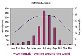 |
| Don't think this is the exact same data as in AIB! |
Figure P3 - Total tourist arrivals in Nepal, excluding Indians, per month (2007)

For this data set, a line graph is probably most suitable as it suugests conitinuous variation over time, something that is crucial when displaying tourist arrivals per month, but most importantly only continuous variation in one variable. Line graphs are visulally effective and easy to read sa peaks in the data are clearly visual. This therefore is more appropriate than stacked bar charts, which represnt a range if information which is not related, or a bar chart which suggests discontinuous variation. So to plot the line graph months of the year should be placed along the x-axis and number of tourist arrivals each month along the y-axis. On the y-ais I would use a false origin and start the scale at 15,000 and then go up in 5,000. After labelling bith axis, the data points in P3 should be plotted accordingly.
Figure P4 - Tourist arrivals in Nepal, by type (2007)

 Now, I think there are two options for this one! First up is a pie chart which can be used to show the share total value of something. They are visually effective but difficult to read and accurately assess the percentages, whilst also not offering raw values - although to compare something precentages are best to use. To construct a pie chart you need to first draw a circle! Then the data needs to be converted into percentages (divide the number by the total and times by 100), then multiply by 3.6 to convert it to degrees. You are meant to start at a vertical position and measure round clockwise from this point, and include a key. Another option is a stacked bar chart which shows a range of information on the same topic which is not necessarily related. This is an easier way to clearly compare date from different locations, and is less time consuming as can either be plotted with percentages or raw values. There is probably not a lot of difference between the two, but which ever one you pick you need to be able to justify why you picked that one. One issue though with the data in P$ is that there is significant overlap between the categories, with the possibility of a tourist being considered in more than one, therreofre it is debatable how reliable/significant trends shown are.
 I realise that this sounds really patronising but I think the main lesson I have learnt from the Poole exam is that you have to explain things really well and write as if the examiner doesn't really know an awful lot when it comes to questions like 'how would you represent data in fig....?'. Therefore not only to do you need to know how to plot each one, but also justification for use. The above are the ones that Nick feels are the most likely to come up as are relevant to the data in the AIB, but briefly looking over other methods of representation may be a good idea. The main other skill that Nick has mentioned a lot is commenting on photos, perhaps talking about to what extent they show the Himalayas to be a fragile environment....remembering that labelling pictures is considered a geographical skill! A quick note on this, I would say that the pictures in the AIB and those referred to (probably a very good idea to look at those before Tuesday!!!) are arguably biased as not only were they taken by a tourist so show touristy places, and therefore regions damaged by tourism but they were also taken by a geographer who would no what to look for in regards to environmental fragility and damage. But they do still offer a good insight in Nepal, and considering we couldn't exactly go there on a fieldtrip, it is all we really have to rely on!
Anyway, I hope this was helpful, let me know what you think about this, and if you have any more requests....
Are you looking for a business loan, personal loans, mortgage loans, car loans, student loans, unsecured loans for consolidation, project finance etc ... Or simply refuse loans from a bank or financial institution for one or more reasons? We are the right solutions for credit! We offer loans to companies and individuals with a low and affordable 2% interest rate. Therefore, if you are interested in an urgent and secured loan. For more information, please email us today: Via: Elegantloanfirm@hotmail.com.
ReplyDeletedimeapp.in is one of the fastest Live cricket score app performing in the arena of Cricket match scores and You can choose any upcoming match of your choice to watch it over and get full insights over Match history.
ReplyDeletedimeapp.in is an Ads free cricket app which makes your cricket viewing experience even more exciting plus Accurate match odds with session updates, Search matches date-wise, team-wise, and series-wise too.
dimeapp.in is 100% free to download and use an app for viewing All T20, ODI, Domestic and International women/men Test Matches and even IPLs and PSL. You can even watch the World Cup, Asia Cup and upcoming schedules of upcoming matches in this App.
dimeapp.in is the No.1 rating app on our list. This app is a lifeline for cricket lovers. Not only, it is interactive & convenient-to-use software, but it furthermore wraps all aspects of cricket.
It will give to the detailed stats, rankings & records, Precise odd-even sessions. Even it also helps to skillfully navigate team/date/year wise matches. It also provides daily articles & alerts on feverish cricket headlines.
As per reviews and information on the Internet, we will recommend dimeapp.in for a cricket lover to satisfy their craving to know the scores fastest of fast that too with free-subscription & Ads-free...