Line Graphs and Bar Graphs
 There are several different types of line graphs that can be used in geographical enquiries:
- Simple Line Graphs = drawn to show a single series of data e.g precipitation
- Comparative Line Graphs = show two or more data sets on the same graph. Often, lines are drawn using the same scales on the x-axis and the y-axis e.g flood-storm hydrograph
- Compound Line Graphs = drawn with several different components (AS students, bewarned you will see a lot of these in the Energy module!). Important to remember to use axis to measure the 'bands/layers' separately.
- Divergent Line Graphs = used when one set of data is proided for part of the period under consideration and then this data set is split into separate components for another part of the period.
A similar variety of bar graphs exists.....
- Simple Bar Graphs = shows a single set of data
- Comparative Bar Graphs = shows two or more sets of data. The columns for each division along the x-axis are drawn side by side
- Compound Bar Graphs = show how the total in any one bar is divided up between a number of subtotals
- Divergent Bar Graphs = start as simple bar garphs but then become compound bar graphs when subtotals become avaliable
Advantages of using Bar Graphs
- show each data category in a frequency distribution
- display relative numbers/proportions of multiple categories
- summarize a large amount of data in a visual, easily intepretable form
- make trends easier to highlight than tables do
- estimates can be made quickly and accurately
- permit visual guidance on accuracy and reasonableness of calculations
- accessible to a wide audience

- often require additional explanation
- fail to expose key assumptions, causes, impacts and patterns
- can be easily manipulated to give false impressions
 = show nature of the relationship, if any exist, between two sets of variables
- Positive Relationship = both variables increase
- Negative Relationship = one variable increases and the other decreases
- No Relationship = no pattern, ith points distributed at random
- Strength of the relationship presented is also indicated, once a line of best fit is drawn (although, it is not always suitable to draw one). The greater the number of points within a closer proximity to the best fit line the stronger the relationship; allowing analysis to be made upon which conclusions can be drawn. Such analysis is subjective though and so often carrying out a Spearman's Rank is a better option, if you want the most accurate and precise expression of strength and reliability of the relationshiop between variables.
- Strength of the relationship presented is also indicated, once a line of best fit is drawn (although, it is not always suitable to draw one). The greater the number of points within a closer proximity to the best fit line the stronger the relationship; allowing analysis to be made upon which conclusions can be drawn. Such analysis is subjective though and so often carrying out a Spearman's Rank is a better option, if you want the most accurate and precise expression of strength and reliability of the relationshiop between variables.
Pie Charts
 = used to show the proportion of the total represented by each category; with each sector representing a component and the size of the sector illustrating what proportion that component contributes to the whole
angle = number in the category x 360
total number
Advantages of using Pie Charts
- display relative proportions of multiple classes of data
- size of the circle can be made proportional to the total quantity it represents
- summarize a large data set in visual form
- be visually simpler than other types of graphs
- permit a visual check of the reasonableness or accuracy of calculations
- require minimal additional explanation
- be easily understood due to widespread use in business and the media
 Disadvantages of using Pie Charts
- do not easily reveal exact values
- Many pie charts may be needed to show changes over time
- fail to reveal key assumptions, causes, effects, or patterns
- be easily manipulated to yield false impressions
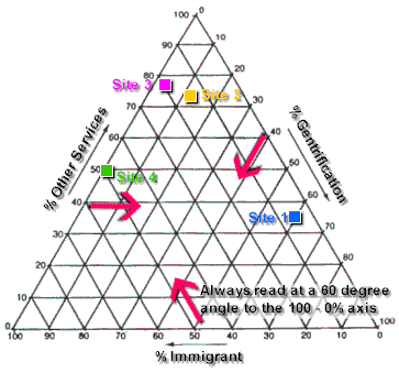
Triangular Graphs= really just a scatter graph that shows three sets of variables
- usually used when plotting employment structures (primary, secodnary and tertiary sectors) or soil structure

Kite Diagrams= plotted to describe distribution of different species along a transect line; so used to compare changes in different variables
- most commonly used for dune transects
Radial Diagrams
Used to show:-
- ORIENTATIONS as given by points on a compass; often used to indicate oreintations of particles in glacial deposits so direction of ice flow can be determined
- CONTINUOUS CYCLE, such as daily or annual progressions
Dispersion Diagrams
- Sometimes called 'Box and Whisker plots'
- Used to show spread of a number of values, displaying range, median, interquartile range, lower quartile range and upper quartile range
I realise that this isn't the most exciting stuff to read but I couldn't think of a more interesting way to write this all up - however, fellow A2 students there is hopefully some Poole-related intertactive timelines and maps on the way! But first, I need to cover statistical tests, especially considering how much my class seemed to 'love' doing them last week.....
Thanks for posting this blog, what a great way to summarise your learning - I hope it's working for you, it certainly helped me to clarify a couple of points. Keep it up please!!
ReplyDeleteThanks, it is always great to hear that other people find this helpful - just let me know if there is anything you would like me to write about! It helped me a great deal with my A-levels!!!
Deletei'm doing my AS and thanks so much this is so useful!!
ReplyDeleteI am glad its helpful to you - good luck with your exams!
DeleteThis comment has been removed by the author.
DeleteThank you so much, this is so useful! Please keep on updating :)
ReplyDeleteYou loyal, I appreciate you - DJ Khaled 201
ReplyDeleteBuy cbd and high thc concentration products from a trusted and reliable online legal cannabis shop with discreet overnight shipment services with no marijuana card needed.
ReplyDeletethc oil for sale online
rso oil for sale
where to buy rick simpson oil
buy rick simpson oil
buy edibles online
buy edibles online ship anywhere
cbd crystals for sale
vape pen cartridge for sale
grape backwoods for sale
cbd products for sale
pre filled vape cartridges wholesale
pre filled hash oil cartridges for sale
hash oil cartridges for sale
order backwoods online
buy thc oil online
cannabis oil for sale
rick Simpson oil buy
buy backwoods online
thc oil for sale online
high thc oil for sale
backwoods for sale
hash oil cartridges for sale online
thc cartridges for sale
exotic carts thc
pre filled vape cartridges for sale
pre filled hash oil vape cartridges for sale online
Have you been searching online for a trusted online cannabis shop where you can find backwoods for sale?,dank woods for sale?where to buy rick simpson oil online?buy edibles online ship anywhere?,then we have all that answered here and more at alpha cbd
shop